This might be the last review of Windows you ever have to read.
Microsoft Corp. is launching Windows 10 on Wednesday and described the release as the “last version of Windows.” From now on, instead of releasing a new cardboard box containing a big software file to install, Microsoft will manage Windows on an incremental update basis via the cloud. It’s the start of the Windows as a Service era.
So how is the kick off to the new model looking? We got our hands on a build as close to the final release-to-manufacturing model possible and put it through its paces. And it looks encouraging – Windows 10 is everything Windows 8 should have been.
Let’s start with getting it up and running.
Installation
There’s not much to say about the installation process and that’s a good thing. Having installed many versions of Windows, many times over, I readied myself for an odyssey of reboots, configurations, updates, and watching a progress bar slowly crawl an immeasurable distance from left to right.
Instead, I barely noticed Windows 10 install as I played videogames on my TV. I started my installation process by backing up some files, but it turned out to be unnecessary. I fired up the Windows 10 installer and the first thing it did was check for updates. Before too long, it was finished and ready to install the new OS. I clicked “Next” to give it the go ahead and it proceeded with the installation. Before too long, it was at the configuration stage – and it suggested I just use the “quick setup” option, so I did – and I was done. The whole process took less than a half hour.
I was upgrading from Windows 8.1 and working from an installation file on a USB drive that Microsoft sent me. A typical installation for most will involve a download of Windows 10 and update from the “Windows update” tool, but should be similar to my experience once downloaded.
I had two user accounts on my computer and both were left in tact with their applications and personalized settings after the installation. Each user will have to sit through a brief wait when logging in for the first time after installing Windows 10 for some configuration in the background.
User interface
I’m using Windows 10 on an HP Spectre hybrid PC. It can be used either like a traditional laptop, or with the keyboard folded behind the screen to serve as a touchscreen tablet – hence the hybrid moniker. This is exactly the type of computer that Microsoft had in mind back when it designed Windows 8, and Windows 10 is even better equipped to take advantage of both modes.
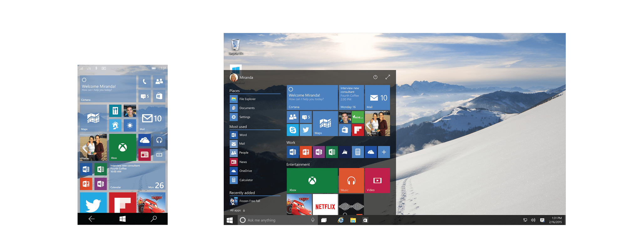
First, the Start Menu is back. One of the big groan factors for Windows users making the transition to Windows 8 was the absence of this menu, instead replacing it with a tile interface and a bar of “charms” that slid out from the right side of the screen.
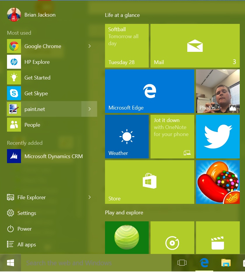
With Windows 10, the Start Menu is back and better than ever. The navigation menu smartly displays your most-used apps at the top, so you’ll find what you need most of the time very quickly. These apps also offer Jump Lists that help you perform specific tasks within the apps or get to a certain location more quickly. For example, your web browser will offer some oft-visited websites and your photo editor will display the most recent files you’ve been working with.
There’s also quick access to the Power menu so it’s easier to shutdown or reboot your PC. A files explorer doesn’t branch out into that complicated hierarchy of little folders we’ve seen in the past, it just launches a file explorer window that’s larger and more suitable to that task.
There’s still some elements from the Windows 8 approach built in here. Docked to the right side of the menu is a list of large tiles offering quick-touch access to some apps. This makes use of Microsoft’s “live tiles” so you can actually glean specific information just looking at this menu. For example, you can see the weather, or if you have a notification in an app that needs your attention.
Some points of tension remain between the new “modern” Windows design and the legacy design of Windows. For example the “Settings” menu off the start menu takes you to a new interface to dig into system properties, devices settings, user accounts, etc. But the traditional “Control Panel” still remains and can be made visible on the desktop. I suppose the idea is that one approach is easier to use when in touchscreen mode and the other for mouse and keyboard, but it seems confusing to offer two different paths to configure the same settings.
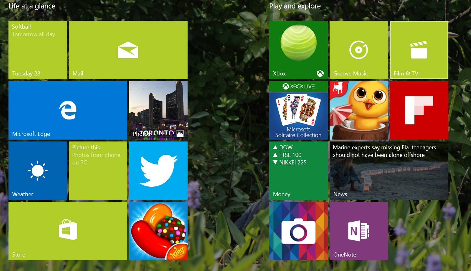
Overall though the UI seems well thought out and motivated by good intentions on the part of Microsoft. There’s some nice touches you wouldn’t expect. When I selected one of my photos as my background, Windows automatically set my theme colours to match colours in the image. There’s also a multitude of new power UI features that make Windows 10 a pleasure to work with for multi-taskers:
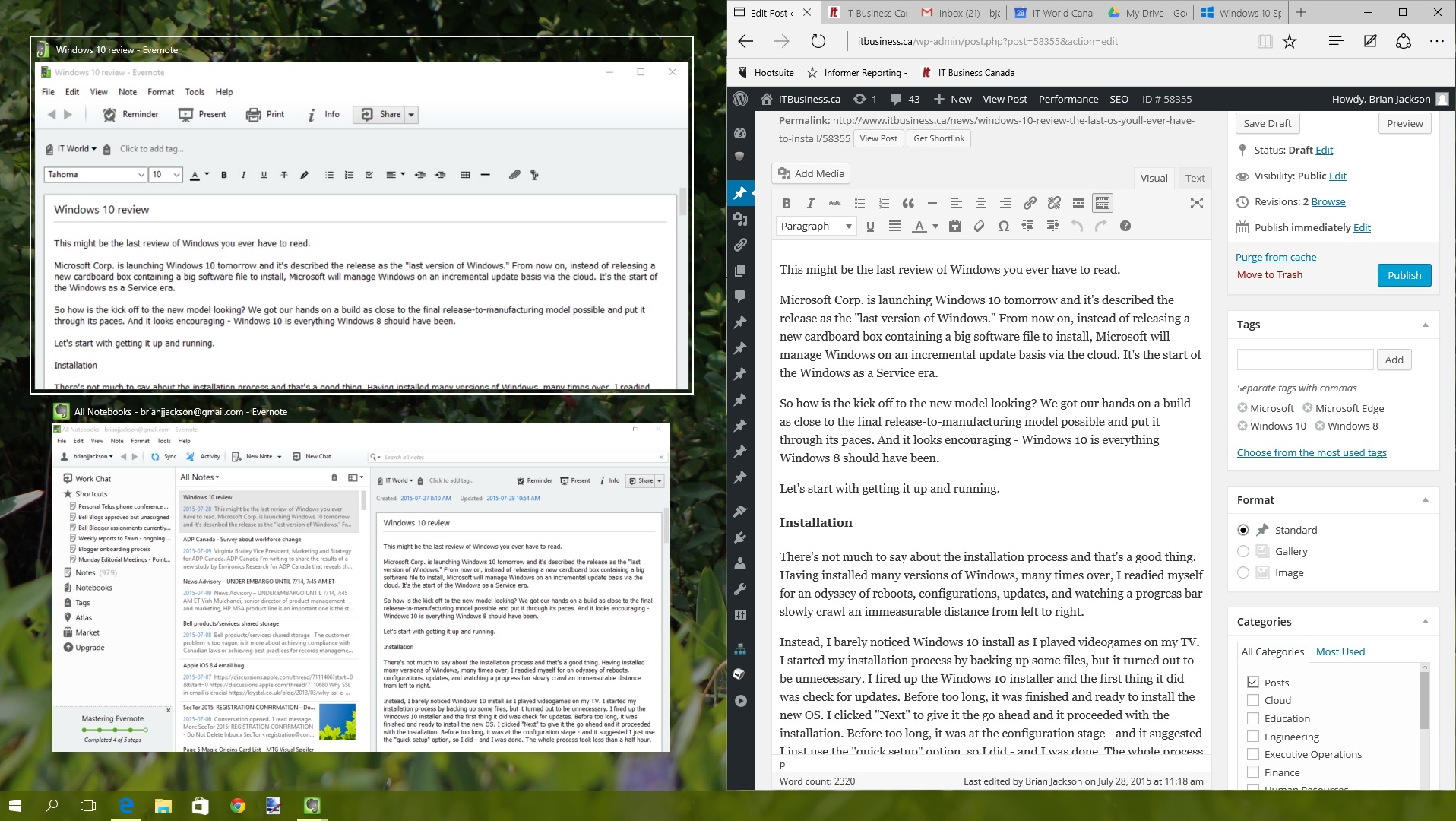
- Snap – Since Windows 7, it’s been easy to snap a window to fit exactly half your screen either by dragging it to the side or by pressing the Windows key and an arrow on your keyboard. Now it’s even better, as Windows displays preview tiles of the other windows you have open and you just click on the one you want to fill the other half of the screen. It’s intuitive and saves you some hassle setting up your workspace.
- Virtual desktops – A feature that Linux and OS X users will be familiar with has made its way to Windows. Click the short cut on the task bar or press Windows + Tab to select different desktops and create new ones. It’s a great way to manage your work flow. Since I tend to need to do a lot of image cropping throughout my day, I keep a photo editor open on one desktop and my web browser open in another.
- Action Center – New to Windows and replacing both the Charms bar of Windows 8 and the notifications centre is this new pane that’s launched out of the system tray. Clicking the word bubble icon or swiping in from the right side of the screen on a touch screen will display it. Here you can see system notifications and get quick access to a range of useful settings or functions, some of which you’d typically associate with a mobile device. Eg. location, VPN, airplane made, create a note, connect with wireless devices, and more.
- Continuum – The ability to switch between tablet mode and desktop mode will be useful to users of hybrid PCs or tablets that can connect to a mouse and keyboard (eg. Microsoft Surface). You can trigger the mode manually, or it will automatically detect when you’ve altered the way you’re using your device and shift to adapt.
Productivity
The default apps that come with Windows 10 will be passable for many, but are unlikely to please power users.
The Mail app for example was easy to set up and it has a clean interface and makes it easy to add accounts and start using email. But the interface is very basic, offering one inbox and a long unsorted list of emails. You can set up folders to organize everything and if you connect a web mail account where you’ve already done this, Mail will even copy the file structure you’ve created there and sync up the different folders on demand. Still, if you have a favourite email app or just use a web client that you access from all your devices, this app will not change your habits.
Similarly, Calendar is easy to set up (once you’ve input your accounts for Mail, you’ll automatically have it synced here too) and offers a simple, clean interface. You can invite contacts to events and manage multiple calendar accounts in one place. It works well and I could see someone liking this as a way to view their schedule. But there’s also no clear compelling reason to not use an already-established system.
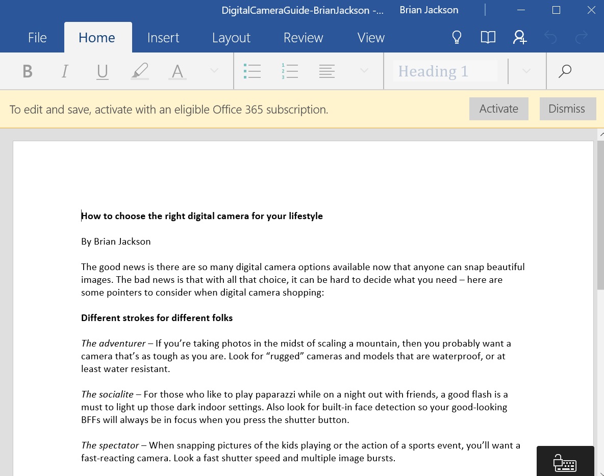
Windows and Office go hand in hand, but there’s no freebies to be had here. By default, Microsoft includes an Office 365 guide that invites you to trial the service for 30 days. After that you have to pay the subscription fee to make use of Word, Excel, Powerpoint, etc. Go to the store and search for Word Mobile, Excel Mobile, and PowerPoint Mobile to find free, Microsoft-made options that will let you open and read Office files. Unfortunately that’s all you can do – you’ll need an Office 365 subscription if you want to create and edit documents. (Hey, Microsoft gave us Windows 10 for free, so I guess it has to make its money somewhere.)
Windows comes with some new tools that I don’t recall finding in previous versions. It’s possible these were already available in the Windows Store for Windows 8 but Microsoft has now surfaced them by including them out of the box (or should we now say “out of the cloud.”) Sift through the apps for helpful tools like a voice recorder, alarms, and Phone Companion. This last app will guide you through setting up your smartphone – whether its an iPhone, Android, or Windows Phone – to sync up with Microsoft’s services that you’re also using on your PC. For example you can have photos you take upload automatically to OneDrive, sync your OneNote, and work in Office Mobile on files shared in OneDrive. Soon, Microsoft will be offering Cortana to iPhone and Android users too and there will be even more synergy.
One downside for Canadian users – Cortana isn’t available in our region yet. Microsoft has been promoting the integration of its smart virtual assistant into Windows 10 as a main selling feature, so it’s too bad I didn’t get to experience it. Hopefully it’ll be released to Canada shortly. One warning – don’t change your region to the U.S. just so you can use Cortana. I once learned the hard way that it’s pretty impossible to change your region back because it becomes associated with your Microsoft account. This will cause you all sorts of trouble with using the Windows Store and accessing Microsoft’s other services.
Microsoft Edge
Replacing Internet Explorer, the familiar browser that has long been packaged with Windows and tends to stir strong emotions in web developers, is a new browser, Microsoft Edge.
Like many people these days, I do much of my work in a web browser. So I adopted Edge to see if I could accomplish my usual tasks with the browser, and it definitely did the job. Edge offers an interface that’s suitable for both a mouse and keyboard or a touchscreen. There are large, clean buttons on offer for the typical browser navigation functions and some utilities unique to Edge.
Your bookmarks (or “favourites”), history, and a reading list feature are all grouped together in Edge’s hub. Clicking on the hub icon brings it out from the right side of the screen to let you sift through web content. (There’s also an option to have a favourites bar along the top of your screen). The reading list is meant to save articles you want to read later, and displays some images and text from the page so it’s easier to find. The reading list feature could be improved if there was an option to save web content for offline reading, so you could read it during a commute in the subway or during a flight.
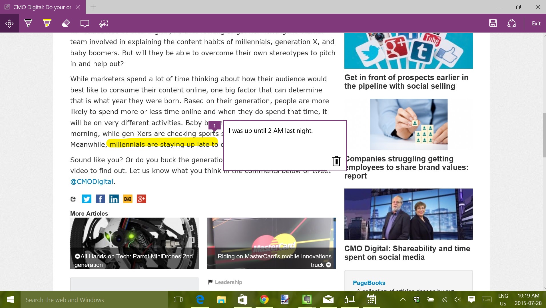
One feature that separates Edge from other browsers is the ability to mark up web pages and save them as notes. Clicking on this icon will flatten the page you’re looking at, turning off any interactivity and bring up tools that let you draw on the page, highlight areas of it, make notes, or clip out sections as images. As a person that makes a lot of web content, I can imagine this being very useful. Especially for teams that are working to improve the design of a website. You can save the notes you create to OneNote, or to your hub as a favourite or reading list item. This ability gives people a reason to use Edge over other browsers, even if the same functionality can be achieved using some third-party plugins on a browser like Chrome
Edge is a very new browser and for the most part my experience was a good one, but I did find a couple of bugs while working with it. When working with multiple Edge windows open, I found it was hard to drag and drop browser tabs from one window to another. Instead of merging with the window I wanted it to join, the tab would often just separate out into its own window and turn blank – then refuse to close. I’m sure this is the sort of thing Microsoft will iron out quickly.
Verdict is in – upgrade today
I can see no reason not to upgrade to Windows 10. It will make your experience with your computer better and the system requirements for it are so easy to meet that if you’re currently running Windows, your computer can definitely support it. Plus, it’s free.
Microsoft has made known its efforts to work with its user community throughout the development of Windows 10 and it shows. Just as an extensive user feedback process led to Windows 7 feeling like a much-improved version of Vista, Windows 10 fixes all the problems that Windows 8 posed and reaches even higher to offer a good experience to users of desktops, laptops, or tablets.
Perhaps what I appreciate the most about it is that the operating system isn’t annoying. There’s no constant reminders to update something, it doesn’t require my permission three times whenever I want to change a setting, and overall it just sort of melts into the background and allows me to work unimpeded. (Or play videogames, that’s important too).
I certainly won’t be rolling back my laptop to Windows 8 and I’ll be upgrading my other desktop PC to Windows 10 as well. After all, it might just be the last OS upgrade I ever have to do.
At least, I can always dream.
TL;DR
Windows 10 comes out July 29 and it’s free for users of Windows 7 or Windows 8. There’s no free Office apps, but you can at least open the documents and read them if you download the Office mobile apps from the Windows Store. The Start Menu has returned with some new features and makes the OS more usable in both desktop and tablet modes. There’s lots of great productivity features that multi-taskers will appreciate. Edge looks like a good replacement for Internet Explorer with the ability to turn web pages into notes being the killer feature. Upgrade and you won’t be disappointed.



Issues by some with the odd message “Something happened” before you can even upgrade. Some suggest changing region & language to match the W10 edit but doesn’t always work.
watching, won’t upgrade from win7 for a long while
Want a reason to NOT upgrade? Your computer and any information on it basically becomes Microsoft/government property and you have zero privacy.
That’s the only one I need.